


There are all kinds of travelers who constantly look over their shoulder with a need to be prepared. This line caters to those suspicious navigators by representing them through illustrated characters just trying to live their exciting lives without being seen.


A celebrity, spy, detective, pirate, and a thief are all suspicious navigators who can’t stick out like a sore thumb. A celebrity wants to avoid the paparazzi to get some peace and quiet. A spy must always be on guard against the enemy. A detective searching for a criminal doesn’t want to spook their suspect. A pirate on the search for treasure aims to evade other treasure seekers. A thief tries to be a few steps ahead of the police to avoid jailtime.


Each character has a personalized looking glass to watch their back on their journey to their daring travel escape. This series uses the art deco style and color palette to relate back to traditional travel posters.


Every side of this line has eyes looking behind the viewer to create interaction with the customer. It was laser cut 1/8” basswood plywood with a kerfed design to give it a rounded edge, which makes an art deco inspired pattern.


The box itself resembles a briefcase to remind you of a go bag or suspicious packaging signs at the airport. With this kit, everyone is properly equipped to escape their routine.


The project goal was to design a 5 part kit with distinguishable features while maintaining a cohesive look in 3 weeks. I didn't know what objects to choose for this kit, so I did some research into package design and wrote what I liked and disliked about the packaging for more conceptual ideas.
I researched what information needs to be included for this type of product and found that there were many more types of adapters than I thought there were. I found it was also important for customers to see the shape of the prongs, so I kept that in mind while designing.
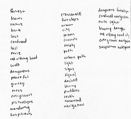
I then used the random word generator to help me come up with unique concepts.
Next I made rough sketches of the packaging itself taking inspiration from suitcases and medicine bags. I originally wanted to make it out of leather, but that seemed impractical for my budget and wanting to create an illustration. I decided to go with a thin type of plywood, because I had access to laser cutting and it felt more durable similar to the heft that most electronic products have.


I then created logo sketches to help create a brand identity.
After critique, I went with the suspicious navigator concept. It was the most in tune with the product itself. I wanted to have more illustration in my work, because that is a strong suit of mine, so my classmates recommended that I look into art deco and their relationship with travel posters. I created a mood board to support that.
I found that objects that were less interesting, but important functionally had some of the most unique and memorable designs for their packaging. I chose to do different types of travel adapters.

I then found a template from Etsy that was quite interesting. It was a wooden display case that used kerf to curve the wood without the need for clamps. (I was in my dorm room, so clamps were not a good option. I still wanted curved edges though, especially with how rigid the wood would feel.) I modified the basic template to create a briefcase design that better matched my vision for this project.
I did several laser cutting tests to construct the box and ended up needing a smaller size. The handle design I had originally did not glue to the wood as securely as I would have liked, so I altered that as well.
On the design side I created a type study and color palettes. I wanted to use a lot of gradients.
I took about a week on the illustrations, because it would be the main focus of the packaging. I roughed it out on paper and then brought it into illustrator to make sharp edges. I wanted to include imagery from locations that require the travel adapters, but I didn't have the time, so I used the patterns on the back as well.
Once that was done I imported it into Autodesk Sketchbook for the coloring. I knew I wanted to use some art deco inspired patterns, so I needed some depth in the characters. To do That I used a few layers of gray to plan it out.
Next I used those gray layers to add gradients from the color palettes.


I printed the front and back and glued it to the wooden briefcase. To polish it I painted the box to match the illustration and I painted the edges black for any craftsmanship errors from cutting the illustrations.


Previous
Next


